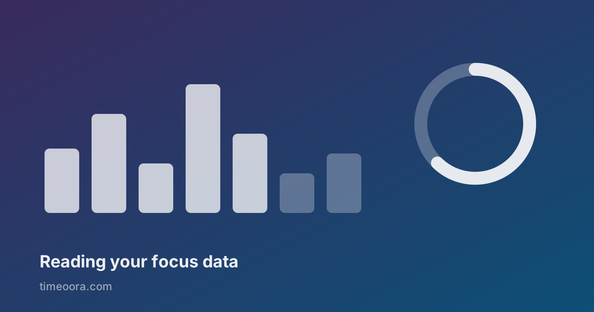
After two weeks of using a Pomodoro timer you have a small pile of data: minutes per day, sessions per category, a streak counter. The temptation is to treat it as a scoreboard. That is exactly how it stops being useful.
Focus data is not a grade. It is a description of where your hours went, and its only job is to make the next week different from the last one.
The four numbers worth reading
Today's total
The least interesting number and the one everybody stares at. A low total today might mean you were in meetings, or sick, or doing work that does not fit into timed blocks. One day is noise.
Read it for one thing only: whether you started at all. Two focused sessions on a bad day is a completely different signal from zero.
The weekly total
This is the honest one. A week absorbs the bad days and the interruptions, and it is long enough that you cannot explain it away. If your weekly focus time is six hours, that is your real capacity for deep work under your current conditions — not what you intended, not what you promised, six hours.
Most people find this number smaller than expected. That is not a failure; it is the first accurate thing they have ever known about their week.
The category split
The most actionable of all. You do not need a chart to know you worked; you need one to know what you worked on. When the split shows nine hours of "Work" and forty minutes of "Study" in a week where you told yourself learning was the priority, the number is not judging you — it is showing you where the priority actually lives.
Categories only earn their keep if you keep them few. Three or four. Twelve categories produce a beautiful chart and no decisions.
The streak
Handle with care. A streak measures consistency, which is genuinely the thing that compounds — and it also creates a perverse incentive to run a token five-minute session at 11:50pm to avoid breaking it.
Use it as a reminder, never as a debt. A streak that makes you start on a low day is doing its job. A streak that makes you fake a session has become the goal instead of the measure.
The numbers that mislead
Total hours all-time. Feels great, tells you nothing about now. It is a trophy, not a measurement.
Session count without duration. Twelve sessions could be six real hours or ninety scattered minutes. Always read count next to time.
Averages across empty days. An average that includes days you never opened the timer punishes you for weekends. Average across active days instead: it answers "when I do work like this, how much do I get?" — a question with a useful answer.
Turning the numbers into a change
A dashboard is worth the trouble only if it produces one decision per week. Not five. One.
Look at the week, pick the single largest gap between where your time went and where you meant it to go, and change one thing about next week: a fixed hour, a category you refuse to start before another is done, a shorter block on the days you are always interrupted.
Then check again in a week. If the number moved, the change worked. If it did not, the change was too polite, or the constraint was somewhere else entirely — often in the calendar, not in the willpower.
Where your data should live
One more thing worth saying: focus data is a diary of how you spend your attention, which makes it more personal than most people realise. It says when you work, what you avoid, how your weeks fall apart.
There is no reason for that to live on someone's server. A timer that keeps its history in your own browser can show you every number above without an account, without a sync, and without anyone else being able to read your week. Timeoora stores everything locally for exactly that reason — the trade-off is that clearing your browser data clears the history, which is a fair price for nobody else holding it.